Computer program finds architectural features most repeated throughout a city's facades

[youtube=http://www.youtube.com/watch?v=s5-30NKSwo8]  From Atlantic Cities: "Paris looks like, well, Paris.  Wander down any side street in a residential neighborhood, and the city simply has a distinctive look and feel, the result of myriad small distinctions, including the way Parisian balconies are constructed." "A question people are much less good at: identifying with some kind of scientific accuracy exactly what makes Paris look like Paris.  But academics at Carnegie Mellon University and INRIA/Ecole Normale Supérieure in Paris suspected that a computer might be able to do this.  They were looking not for the big, obvious landmarks like the Eiffel Tower, but for 'the visual minutiae of daily urban life.'  These are the patterns of smaller features in building design that repeat themselves all over a city."

"The researchers note that their algorithm had a much harder time with American cities, where some of the most commonly identified elements were car models and road features."  Full article here.

From the "What Makes Paris Look Like Paris?" project webpage: "Given a large repository of geotagged imagery, we seek to automatically find visual elements, e.g. windows and balconies, that are most distinctive for a certain geo-spatial area, for example the city of Paris.  We show that geographically representative image elements can be discovered automatically from Google Street View imagery in a discriminative manner."  Website includes paper, open-source codeParis/non game, and more related resources.

My theory: a city's cultural tourism logo is the architectural style of its small buildings.

Free download of materials from recent 2-day seminar in Miami on small rental buildings

A 2-day seminar called "Acquiring & Managing Scattered Site Rental Housing" was presented by the Florida Housing Coalition earlier this year on February 28 and March 6.  The seminar focused on non-profits that are considering buying and fixing up small rental buildings, and the challenges involved.  Presentations included Scattered Site Rental HousingIs Your Board on Board?Organizational Capacity EvaluationCapital Needs ExampleFunding Sources, and Low-Income Housing Tax Credit Example (click on links to download presentation materials).  Presenters also gave out some papers and articles related to small rental finance and management, which are now listed on the "Own" page, see tab above.

Study of 9 cities finds 5x more property tax per acre from multi-story mixed-use buildings

[youtube=http://www.youtube.com/watch?v=PRMqhkAcJe0]The Sonoran Institute recently commissioned a study called "About Town" (undertaken by Urban3), of 9 cities' property tax per acre from conventional development vs. multi-story mixed-use development.  From the study website: "Financial strain can be a burden on local governments, but it can also be a force for change, encouraging officials to build stable revenues while spurring economic growth. "In the search for solutions, local officials would do well to recognize the value of downtowns and mixed-use centers.  This study found that in terms of dollars per acre, mixed-use downtown parcels bring in, on average, five times the property tax revenue as conventional single-use commercial establishments."  Study brochure here, full text here, write-up in Arizona Trend Report here, and Sept 20 webinar registration here.

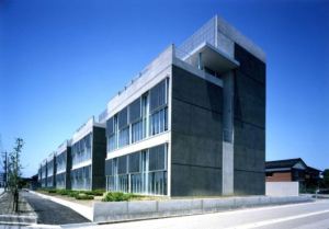
10 infill projects that maximize constrained sites profiled in most recent Urban Land Magazine

From Urban Land writer Ron Nyren, an article profiling 10 infill projects that maximize constrained sites: "By filling vacant lots, infill development can enhance street life and help curb sprawl.  However, facing relatively higher land costs, developers must do more with less.  Zoning rules, oddly shaped sites, the proximity of adjacent buildings and infrastructure, and other constraints require creative design and engineering strategies."  Profiled projects are:

Full article here.  (Photo credit: Jeffrey Totaro.)

Baltimore Rowhouses are flexible, resilient, "weather all trends, accomodate all needs"

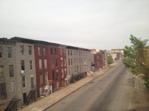
From Community Architect blogger Klaus Philipsen: "Several US cities take their urban form mostly from one particular kind of housing, the rowhouse.  This is especially true in the northeast and mid Atlantic where Boston, Philadelphia, Baltimore, and Washington all have long rows of attached houses. "The well-to-do folks know these neighborhoods from the windows of an Amtrak coach, with seemingly endless decrepit and abandoned rowhouses.  Thus, next to the highrises of the 'projects', the rowhouse has the lowest status of all housing types.

"The bad name is undeserved for many reasons.  The rowhouse offers direct access from the ground and direct access to a yard, however small.  Nobody walks over anybody else's head in a rowhoue, there are no public hallways, stairways, or elevators to take care of, and still density can be as high as 45 units per acre.  Only two walls are exposed, the roof area is minimized, and the footprint is small.  This makes the rowhouse quite sustainable.

"In all the images of abandoned and boarded-up rowhouses it is often overlooked how the rowhouse has also been successfully adopted by yuppies and urbanistas of all colors.  From Georgetown to Federal Hill to Society Hill, the rowhouse has been the backbone of the gentrification of these neighborhoods.

"It can't be the rowhouse that is at fault when a neighborhood declines.  Rather than being the culprit, the rowhouses has proven itself as resilient enough to weather all kinds of trends and flexible enough to accomodate all kinds of needs."  Full post here.

Kuala Lumpur's shophouses are its "most beautiful sights", need renovation, say world travelers

From Perpetual Traveler writer Dasza:  "Old Chinatown and its shophouse architecture, built during British colonial times, are the most beautiful sights in Kuala Lumpur. "In 1896 Kuala Lumpur was the capital of British colonialism.  The British instructed that all wooden houses shall be replaced by brick and get tiled roofs.  The façades reflect the popular architectural style of those times.

"The Old China Café is really worth mentioning, with (a bit) better food and traditional Malay dishes on the menu and most of all, shows great effort to preserve a shophouse in its old glory.  Upstairs was a Chinese tea house, with the best blend we have tasted so far.

"Unfortunately, most shophouses in Kuala Lumpur, originally constructed between the end of the 19th century and the 1920s, were renovated with very little sensitivity to their architectural design.

"An elegant row of shophouses with distinct rooflines, columns and window shapes. Harshly contrasting with its steel-glass progeny.

"My favourite Kuala Lumpur Abbey Road cover. Where are the Beatles?"  Full post here.

Urban typology author to speak at Univ. of Miami on Sept 28 at 6 PM on topic of cohousing

From Univ. of Miami Office of Civic & Community Engagement: "On September 28th, we are co-hosting 'Building Groups in Germany: A Democratic Alternative for Multi-Family Housing' in partnership with University of Miami School of Architecture Professor Eric Firley.  The lecture and discussion will feature Dr. Natan Hogrebe, Partner at Schwenke & Schütz in Berlin and expert on the topic.  This event will be held at 6:00 p.m. in the University of Miami School of Architecture's Glasgow Lecture Hall."  Firley is co-author of The Urban Housing Handbook, maybe the best primer on global urban typologies, so don't miss the event.  To learn more about UM Civic & Community Engagement, follow on Twitterfriend on Facebook, or visit CCE website.

Population growth shifts to cities, retail shrinks to follow, e.g. Office Depot prototype 5,000 sq ft

From NYTimes writer Stephanie Clifford: "As young Americans move to cities, retailers that grew up in the suburbs are following them.  With little room to expand in the suburbs, retailers, including Office Depot, Wal-Mart and Target, are betting that opening small city stores will help their growth.  'The suburbs are basically saturated with retailers,' said Patrick Phillips, chief executive of the Urban Land Institute, an urban-planning research nonprofit. "And unlike previous efforts, they are doing it the cities’ way.  The retailers studied city dwellers with anthropological intensity and overhauled things as varied as store sizes (the city stores are a small fraction of the size of the suburban ones), packages (they must be compact enough for pedestrians) and signs (they are simple, so shoppers can get in and out within minutes).

"Office Depot has revamped its stores to create an 'economically defensible' way of expanding into cities, said Kevin Peters, Office Depot’s president of North America.  The main objective for shoppers in cities is speed.  So a store in Hoboken that is a model for the company’s urban branches is 5,000 square feet, about a fifth of a normal Office Depot.  The shelves are about six feet high, much shorter than in a suburban store, so visitors can navigate quickly.  The signs above the aisles are simplified so customers do not waste time interpreting them.  The service desk, where shoppers can send packages or copy fliers, takes up a big chunk of the store, so no wandering is required.

"A typical Office Depot has 9,000 items for sale.  This one has 4,500.  It sells immediate-replacement items (a pen) versus stock-up items (a 25-pack of pens).  At sites where Office Depot has replaced one of its big-box stores with a small store, Mr. Peters said, the smaller iteration has retained 90 percent of the sales of its bigger predecessor."

"Retailers are now willing to come into cities on the cities’ terms — with all the zoning headaches, high rents and odd architecture — because that is where the growth is. Most large American cities are growing faster than their suburbs for the first time in almost a century, according to a Brookings Institution analysis of census results released last month, largely because young adults are choosing urban apartment life. That population shift, along with Internet competition, have made the car-focused, big-box model less relevant."  Full article here.

Headline impossible to improve: "How to make a pile of dough with the traditional city"

From New World Economics writer Nathan Lewis: "We've been working on a series of ideas for creating Traditional City-type neighborhoods that will nevertheless be compatible with Suburban Hell as it exists in the United States.  In practice, this means that each home requires at least one space of off-street parking.  One of our first forays into the subject was the New New Suburbanist pattern, which combined 40x50 (2000 square foot) single-family house plots with 16-foot Really Narrow Streets. "That was fun, so now we want to up the stakes a bit and double density once again, reducing the house plot size to around 1000 square feet, or 20-25 feet wide by 40-50 feet long. We will retain at least one off-street parking spot per site.  Once again, we will use the Really Narrow pedestrian street of about 16 feet wide.  The high population density itself does a lot to solve the problem of automobiles, because, at that level, a lot of things are now in walking distance.

"With a plot width of only 20-25 feet wide, the buildings become quite close together or even fully attached, a format commonly known as a 'townhouse.'  My point is, this is a very common format throughout the world, for people who live in towns, i.e. urban environments.  So, when I talk about a 20-25 foot wide plot, you have to get over the 'that's insane!' reaction you might have, because it's not insane at all. It's normal.

"The basic problem we face today is somehow integrating that off-street parking into our townhouse design.  The basic problem with townhouses and parking is that you can tend to end up with the 'wall of garage doors' effect.  One solution is just to have a variety of solutions.  Some houses have double-width garage doors, some have cars parked outside, some have single-width garage doors with stack parking, some just have parking for only one car, some have side parking.  If you have a lot of variety, that helps a lot."  Full post here.

Mid-rise mixed-use Tumblr, submit your photos of "most popular urban form in history"

From midrisemixeduse.tumblr.com: "Four- to eight-story ('mid-rise') buildings that contain two or more of: apartment, office, retail and cafe/bar/restaurant ('mixed-use').  The most popular urban form in history, but sadly rare, difficult to finance and often illegal in North America today.  Many contemporary American developers love to pretend this building type is innovative.  Environmentalists like their inherent energy efficiency ('squat' shape, when compared to towers or detached buildings) and urbanist placemakers like their compact human scale."  submit here, RSS here, archive here.  (Image above from 6 hrs ago, of Busan, Korea.)

Royal Institute of British Architects gold medal goes to Dutchman, champion of adaptability

From the Royal Institute of British Architects Gold Medal 2012 citation for Herman Hertzberger: "For the Dutch architect Herman Hertzberger the structure of a building is not an end in itself, it is literally the framework for the life that goes on inside it, a life that is determined by its users. "Herman Hertzberger was one of the leaders in the movement away from functionalism in the mid-20th century.  Influenced by semiotics, linguistics and structural rationalism, he sought to identify an underlying order in a building's construction that is not related purely to its function.  He saw this as analogous to the deep grammatical structures in language explored by Claude Lévi-Strauss; just as grammar is brought to life in speech, so the fundamental tectonic order in buildings is given social meaning by the way in which they are inhabited.

"Structurally, Hertzberger's buildings are characterised by a clear articulation of the supporting lattice. This creates a series of cellular zones within which minor elements like sills, benches and thresholds are used to prompt human occupation.  Throughout his architecture Hertzberger employs a grammar of elements that enables people to define their own habitat within the structure.  What Hertzberger wants is an architecture that can be interpreted and used by the inhabitants in many ways.  For him all buildings should adapt themselves to different needs.  His architecture permits a flexible use and can always accommodate the unexpected.

"His architecture contain lessons that have nothing to do with representation or image-making, but that have much to do with the manner he perceives the way people live together.  His debt to anthropology is manifested in his particular concern for these defined territories which are both joined and separated by liminal or threshold elements.  These 'in-between' pieces set up a dialogue between adjacent spatial orders, as well as encourage social interaction.  The stairs and corridors are not isolated elements, but are essential to the life that fills the building; to see and being seen are the first steps towards a more satisfactory and fulfilling existence.

"He is an advocate of the open society in which encounters are not planned, but occur in a spontaneous, natural manner.  His architecture facilitates such a use and stresses more the sight and contact lines than the representational character of the facades.  For him architecture is not only a social activity, but should also stimulate the user into finding his or her place in society.  It has to receive meaning and it has to be able to give meaning.

"In doing this he admits our changing needs, but insists on the continuity of deeper patterns of dwelling, and sets architects the challenge of finding constructional rhythms to frame the fundamental patterns of human inhabitation.  This was not only a powerful criticism of early Modernism's linking of form to use, but it also set contemporary architecture a stern challenge."  Full citation here.

Miami small, adaptable building gets AIA as tenant, but will more architects appreciate type?

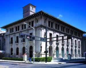
From Miami Herald writer Elaine Walker: "Over its approximately 100-year history, downtown Miami’s post office building has been home to a federal courthouse, the Miami Weather Bureau and most recently, an Office Depot.  After standing empty for at least a half-dozen years, the circa-1912 building is about to get a new tenant befitting of its stature on the U.S. National Register of Historic Places.  The building on NE 1st Ave, a block north of Flagler Street, will be the home of the first American Institute of Architects’ Miami Center for Architecture & Design. "The center aims to be a community meeting space and destination for anyone interested in architecture and design.  The center will include exhibit and gallery space, host lectures and serve as the launching point for guided architecture walking tours throughout Downtown Miami.

"The Neoclassical Revival building underwent a multi-million dollar renovation to bring it back to its original grandeur.  Owner Scott Robins, who purchased the building more than a decade ago for $2.5 million, says he kept it empty for years because he couldn’t find the right tenant.

"'Part of this idea is to get people to understand that Downtown Miami has a lot of historic gems that people don’t notice,' said Alyce Robertson, executive director of the DDA. 'We have a lot of very interesting architectural history that’s still in place.'"  Full article here.

Messy Urbanism Part 3 of 3: BWM Guggenheim research shows mess enables culture, engagement

From BMW Guggenheim Lab blogger Christine McLaren: "The debate at hand at the Lab that day was all about aesthetics: when it comes to the city, what is beauty?  Who gets to decide that?  And what are the consequences of that decision when it’s applied to the urban fabric?  I needn’t tell you that there was no consensus nor did anyone expect to find it. "However, one of the panelists, Jürgen Krusche from the Institute for Contemporary Art Research at the Zurich University of the Arts, brought to the table the argument that ugliness — a word he used to describe the sort of chaotic, patchwork wildness or messiness that a city garners when it is left to fall apart slightly — is what enables vibrancy to happen. What’s more, he argued that that vibrancy is more important to quality of life than 'beauty,' which is often defined by cleanliness and order.

"'Decay,' he said, 'leaves gaps that allow for life to spread' and for people to self-build the urban fabric in accordance with their own dreams.  That gives us a connection to our city, which makes us feel comfortable in it.  Krusche made this same case in his now famous article, 'Berlin ist hässlich—und das ist gut so!' ('Berlin is ugly—and it’s good that way!'), arguing that this is the phenomenon that helps make Berlin such an attractive city.

"Anyone who has been to Berlin knows that it is not, in the traditional sense of the word, a beautiful place.  It is not only a city of mismatched architecture, much of which comes from what I would personally go so far as to call some of architectural history’s most depressing periods, but also one whose political and economic history has resulted in a much slower investment or re-investment process than in other places.  That is a part of what has enabled Berlin’s seemingly lawless and DIY aesthetic to proliferate until now.

"It’s not only Krusche that argues for this state of things in cities.  When New York Lab Team member Charles Montgomery and environmental psychologist Colin Ellard gathered data about people’s emotional and physiological reactions to different forms of streetscape and urban design during their co-designed 'Testing, Testing!' experiment, one of their surprising findings reflected, to a certain extent, the case for messiness.

"They found that people actually felt happier and more activation, excitement, and engagement standing in front of an older, more crowded, messier streetscape than they did in front of a newer, simple, clean, blank façade.  What’s more, as Ellard emphasized to me recently when I called him to rehash my understanding of the experiment, the contrast was even stronger in visitors to the neighborhood and city than it was with local residents.

"If ugliness is better for our cities than beauty, if messiness makes for better, more vibrant, and livelier spaces than manicured perfection, how can we build that?  Is this something that can only come with time and disintegration, or is there a way to apply this to new development?"  Full post here.

Boston's North End model for long-term economic growth: local, slow, continuous, not "frothy"

From New Geography writer Richard Reep: "Are we heading into a new era of local solutions to economic problems?  A good example from recent history is the turnaround performed by Boston’s North End neighborhood.  Before World War II, this neighborhood was a classic immigrant community, and considered unhealthy, dangerous, and poor.  After the war it was blacklisted by bankers who refused mortgages for home buyers, and the North End was cut off by the Central Artery highway running through the city. It became Boston's odd, leftover district. "But a mysterious thing happened to the North End.  The nation's great urbanist, Jane Jacobs, visited it in 1959 with the director of the Boston Housing Authority, who wanted to show her the neighborhood before it was razed in the name of urban renewal.  What she saw was a vibrant, robust street life, beautifully restored buildings, tenements that had been repurposed for middle-income flats, and a sense of pride in the neighborhood.  After researching the area, she discovered it had the lowest crime rate, disease rate, and mortality rate in the city.  Jacobs successfully staved off the bulldozers, and the North End still exists as one of the most picturesque neighborhoods in America today.

"Because the North End was cut off by institutional investors, the neighborhood became economically introverted.  Construction work was done on a cash or barter basis, and people made slow, incremental changes to their residences as the money became available.  Instead of relying on banks for big credit infusions, North Enders relied on themselves.

"As in the North End, no one is waiting for the big banks to come in and fix things.  Instead, people are turning local needs into opportunities at a scale that is small enough that outside help is not needed.  Under our very noses, a new economy is being born.  Our towns and cities will adapt to this form long before it is noticed by the mainstream.  The ingenuity and ambition of individuals will be the factors that bring us out of the Millennial Depression, and create a new economy for the future."  Full article here.

Messy Urbanism Part 2 of 3: Toronto 'hoods with condo towers need surrounding, vibrant mess

From Toronto Star writer Shawn Micallef: "People will see a new development and mutter 'another condo' in a voice they’d otherwise reserve for petty villains.  It’s an odd form of self-hate.  With so many of us living in condos — the only form of property ownership many of us will ever be able to achieve in this inflated market — they will dominate our domestic landscape for a long time to come. "The problem with so many buildings on our main streets, even ones that look nice high up in the air, is they get the first few floors wrong.  They feel like the mall: overly controlled by one owner.

"Yet in North York there is an ideal situation.  When you walk along Yonge here you almost forget about the towers because of a narrow strip of 1-to-3 storey commercial buildings between them and the street.  The upper stories are sometimes most interesting, with hidden cafes and more quotidian outfits like insurance brokers, muscle clinics and E.S.L. schools.

"These humble buildings contain everything a city needs, layered vertically the way cities do best, so there’s always something to discover.  It’s the kind of 'messy urbanism' that makes so many Toronto streets good to walk along.  Messy is a hard concept for developers to mimic, but some are trying."  Full article here.

George Town, Malaysia Art Deco shophouses: even small buildings play with forms, break taboos

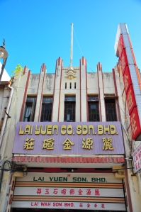
From blogger Carolyn O'Donnell: "Art Deco curves and flourishes can make almost anything look more stylish.  In the opening credits of Sex and the City, it wasn’t Carrie’s stupid tutu dress that grabbed our attention, it was the stunning crown of the Chrysler Building.  Penang’s capital George Town doesn’t have any buildings that were briefly the tallest in the world, but it does have shophouses that incorporated elements of the French design movement into their facades. "It took me a long time to notice them, partly because a shophouse/Art Deco pairing seemed about likely as Sarah Jessica Parker dropping into George Town for a big bowl of curry mee.  And then I started to see them, especially in Campbell St, which was the fashionable centre of old Penang.  It is also in the centre of the Unesco heritage site zone, which hopefully should ensure their protection, and for the sad, neglected ones, some refurbishment.  When I really started looking, I was surprised to see a large Art Deco apartment building on Campbell, near Penang Rd, under which at least eight businesses were trading away.

"The largest concentration of Art Deco – or as it is known in the US, Streamline Moderne – architecture in America can be found on Miami Beach, and the colourful buildings are an attraction in themselves. Less opulent than their Parisian counterparts due to Depression shortages, they still feature curves and theatrical decorative touches, as do these buildings here in Penang.  The early Twentieth Century was an exciting time for art and design, because there were so many new forms to play with, and taboos to break."  Full post here.

Messy Urbanism Part 1 of 3: Toronto's fine-grained mess is photographer life's work, now book

From Blog TO writer Derek Flack: "The best representation of the changing nature of Toronto's streetscape over the last 30 years or so is surely the work of Patrick Cummins. A photographer with a keen eye for minor architectural details — be it alterations to signage or the makeshift renovations that tend to accompany a building's change in ownership — his images subtly capture the ebb and flow of our city's existence. "For the last few years the best way to get a sense of Cummins work was to pay a visit to his Flickr photostream.  With the release of Full Frontal TO: Exploring Toronto's Vernacular Architecture that has changed.

"Whether it's the typologies of variety stores and back-alley garages or the juxtaposition of buildings like 140 Boulton Avenue over a 25 year period, the way the photographs are laid out illustrates further the programmatic nature of Cummins' work.  This is highly organized documentation of the figurative marrow that makes up the bones of this city: its often under-appreciated vernacular architecture.

"Conventional wisdom dictates that Toronto lacks the photographic heritage of cities like New York and Paris.  While there's some truth to this, Cummins is very much our own Eugène Atget.  The great Parisian photographer wasn't interested in shooting sweeping panoramas of the city, but instead focused on storefronts and façades, the everyday architecture through which the character of the city is revealed.

"This is also the story of Cummins photographs.  Seldom beautiful by most standards, they nevertheless fascinate in their ability to show off what an adaptable and ever-changing city Toronto is."  Full post here and extensive interview here.

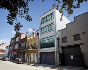
New Orleans townhouse is new construction and warehouse style but fits in on historic block

From Times-Picayune writer Stephanie Bruno: "The Dunns got the itch to trade in their five-bedroom house for an urban roost once their four children had flown the coop, but couldn't find the right place. "Cathy Dun says, 'One day Durward drove me to Diamond Street, stopped the car, and said "What do you think?" And I said, "What do I think about what?"'  All she could see was a nondescript building, one story tall with an oversized garage door.

"But as the conversation unfolded, it became clear that Durward Dunn already had a plan mapped out.  'We'd get permission to tear it down and then build what we wanted there, a place with off-street parking on the ground level, several floors of living space, and a rooftop deck,' he said.

"Situated in a tightly packed row of buildings on South Diamond Street, in a neighborhood where 1820s townhouses and later 19th-century buildings make up the fabric, the building that the Dunns and architect Don Fant proposed matched the scale and proportions of the block perfectly.

"At four stories tall plus a glass penthouse that provides access to the roof, the home fits snugly on its 22-foot-wide lot.  'In a way, this is a building within a building because the entire load is borne by the steel structure we built inside the brick walls on either side, and none of it is carried by the walls themselves,' Durward Dunn explained.

"Rather than try to mimic or replicate a historic building, theirs would boldly wear its contemporary stripes for all to see.  Oversized warehouse-style metal windows on the front and rear facades distinguish the Dunns' home."  Full article here.  (Photo credit: Rusty Costanza.)

Spiking the football, Richard Florida in WSJ: "hubs of innovation are mid-rise, mixed-use"

In the Wall Street Journal, the source for news and opinion that entrepreneurs trust around the world, from writer Richard Florida, maybe the most famous living public intellectual, a message for every planner, developer, investor, lender, architect, government official, man, woman, and child: "The question is: How should we build?  For many economists, urbanists and developers, the answer is simple: We should build up.  Still, density is only part of the solution.  Giant buildings often function as vertical suburbs, muting the spontaneous encounters that provide cities with so much of their social, intellectual and commercial energy. "It turns out that what matters most for a city's metabolism — and, ultimately, for its economic growth — isn't density itself but how much people mix with each other.  In fact, there are two types of density, according to a recent study by Peter Gordon of the University of Southern California and Sanford Ikeda of the State University of New York, Purchase.  'Crude' density is achieved by districts packed with taller and taller buildings but doesn't, on its own, generate innovation or economic development.

"By contrast, what the authors call 'Jacobs density' sparks street-level interaction and maximizes the 'potential informal contact of the average person in a given public space at any given time.' It makes networking and informal encounters more likely and also creates a demand for local products and diversity — not just of populations and ethnic groups but of tastes and preferences.

"The authors dub it 'Jacobs density' in tribute to Jane Jacobs, the renowned urbanist and author of The Death and Life of Great American Cities.  She famously said, 'In the absence of a pedestrian scale, density can be big trouble.  Densities can get too high if they reach a point at which, for any reason, they begin to repress diversity instead of to stimulate it.'

"Look at New York City.  Its hubs of innovation aren't the great skyscraper districts.  The city's recent high-tech boom — 500 start-ups in the last half decade, among them Kickstarter and Tumblr — is anchored in mid-rise, mixed-use neighborhoods like the Flatiron District, Midtown South, Chelsea and TriBeCa."  Full article here and NPR radio segment (audio and transcript) here.

Portland new office building: 38x100 ft, 7 stories, no parking, contemporary but contextual

From Urban Land writer William Macht: "Building small but tall office buildings on very small sites is a challenge.  Developing with no anchor tenant s or parking exacerbates the difficulty exponentially.  Bur the bSIDE6 building on a downtown frings site in Portland, Oregon demonstrates how dramatic architecture, coupled with dogged persistence, can persuade lenders, the city, and the market to overcome these challenges. "In 2006, the principals of bSIDE6 found a small vacant lot -- only 38 by 100 feet.  The site is only one block from the new Eastside Streetcar Loop.  Neighboring buildings were permitted to build arcaded buildings over the sidewalks when their properties were narrowed in the 1920s to widen the street.  The developers sought to follow this old design technique by projecting upper volumes above the sidewalk.

"Works Partnership was the young architecture firm that had designed the adaptive use of nearby creative-space buildings that had attracted many startup, young, and growing companies.  As is often the case, the constraints of a project can constitute the seeds of their solution.  The fact that the floor plates might only average 3,800 square feet meant that entire floors could be leased to single tenants, minimizing common areas.

"Thought bSIDE6 is radically modern, unlike the neighboring arcaded buildings, it shares the same language of form and therefore respects and enhances the district."  This article is not available online, only in Urban Land Magazine, so join ULI already!